logo |
Message boards : Number crunching : logo
Previous · 1 · 2
| Author | Message |
|---|---|
 rebirther rebirther Send message Joined: 10 Sep 07 Posts: 18 Credit: 2,832,564 RAC: 0 |
LOL, but I am not finished with it yet. Whatever you see that I did above (or below, depends on how you read threads), was just testing. I'm waiting for Simek to complete the background colour for the forums. Wanna see ;) I love blue colors :) |
|
Ageless Volunteer moderator Volunteer tester  Send message Joined: 11 Sep 07 Posts: 104 Credit: 155,932 RAC: 0 |
I've made some more. Not in the least finished, they're just examples and for me to see what is possible. Embossed.  I kinda like the 2nd one. All I did to it was change the colour balance. The blue you see is again an example of what may come as the background of these forums. Earlier today I spoke with TJM about the logos and if we would hold a contest. We will. When he's done with getting the majority of errors out of the backend. It'll be an open to all contest to make a good logo for the project, so not only to Rebirther and me. Therefore, if you know other people who make logos/additional graphics for projects, or you do this yourself, (tell them to) flock together here! Give some examples of what you'd do. Then when the real contest starts, we can all sit back and go oooh and aaah as the other person wins. ;-) Jord. BOINC FAQ Service. |
|
Anonymous Send message Joined: 11 Sep 07 Posts: 19 Credit: 474 RAC: 0 |
Last two samples: I like these two the best; as for which of the two I like better, I'm kinda leaning towards the second. 
|
|
Campion Send message Joined: 17 Sep 07 Posts: 9 Credit: 6,837,407 RAC: 0 |
Like the logo with the picture of the wheels / disks in it. However, I also like the idea of using the original Enigma logo oval. Could you make one with the picture on left and in the blue box on the right put the original Engima logo oval ? Just my thoughts... |
|
rebirther Send message Joined: 10 Sep 07 Posts: 18 Credit: 2,832,564 RAC: 0 |
Like the logo with the picture of the wheels / disks in it. I have tested it but doesnt fit together :/ |
|
Anonymous Send message Joined: 11 Sep 07 Posts: 19 Credit: 474 RAC: 0 |
Well, if it doesn't fit, you can always shrink it. It should fit then. :-)
|
|
rebirther Send message Joined: 10 Sep 07 Posts: 18 Credit: 2,832,564 RAC: 0 |
Well, if it doesn't fit, you can always shrink it. It should fit then. :-) shrink or not, it looks terrible :( |
|
Campion Send message Joined: 17 Sep 07 Posts: 9 Credit: 6,837,407 RAC: 0 |
Well, if it doesn't fit, you can always shrink it. It should fit then. :-) :( OK take your word for it. Thanks for trying. |
|
Saxbryn Send message Joined: 15 Oct 07 Posts: 1 Credit: 38,478 RAC: 0 |
 Small, plain and by far not as colorful as the other attempts, but easy on the eye :) Fits better into a template with dark background and light font colors though. Edit: Slightly enlarged version (120%)  |
|
Tommy Send message Joined: 16 Sep 07 Posts: 7 Credit: 107,464 RAC: 0 |
Very nice ... however, we should also change the letters are repeated (for example the "m"). |
|
tommy2x Send message Joined: 20 Dec 07 Posts: 3 Credit: 26,860 RAC: 0 |
I have made some Logos. I`m not a pro in Photoshop but I had time to do some work...     Greetings tommy2x |
|
Cori Send message Joined: 16 Sep 07 Posts: 11 Credit: 19,320 RAC: 0 |
Hello guys, I couldn't resist playing a bit with Photoshop as well... ;-) Logo:  Stat-Icon:  Favicon, black background:  Favicon, transparent background:  EDIT: Actually I like the current favicon better than mine.*LOL* Greetings from Cori 
|
|
MJ Send message Joined: 17 Nov 07 Posts: 16 Credit: 95,844 RAC: 0 |
I have made some Logos.  Love these, wins hands down. |
|
Ireland BOINC Send message Joined: 10 Sep 07 Posts: 4 Credit: 372 RAC: 0 |
I done a logo too. This project has some history. So my logo has a sentimental feel to it. Its in memory of those brave men that lost their lives at sea in the second world war.  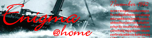 |
|
Buxom Babe Send message Joined: 13 Jan 08 Posts: 7 Credit: 275,534 RAC: 0 |
Nice work. My favorites:  |
|
MJ Send message Joined: 17 Nov 07 Posts: 16 Credit: 95,844 RAC: 0 |
I done a logo too. I like these as well. One of the ones I reference in my previous post disappeared for some reason. I'm not sure that red color of the gibberish fits well tho. |
|
Ireland BOINC Send message Joined: 10 Sep 07 Posts: 4 Credit: 372 RAC: 0 |
Thanks for saying you liked it! :) The "gibberish" as you call it is what you are crunching on your PC. The "gibberish" is the M4 enigma message that they received back in 1942. Its what you are trying to crack the code for! I just copied and pasted the message from here; M4 first break interpretation and translation. The gibberish has significance....LOL Looks like the admins are not reading this message! Time to pick a logo, any of them, i don't mind. John.:) |
|
Ireland BOINC Send message Joined: 10 Sep 07 Posts: 4 Credit: 372 RAC: 0 |
I made 2 more banners, these ones don't have the gibberish. I used the english translation of the broken code. So you can read the gibberish in these images :) 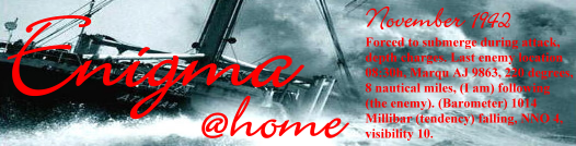  Email sent to admin asking him if he thinks a nice logo or banner is a good idea. Link to this message sent. John. |
|
Ireland BOINC Send message Joined: 10 Sep 07 Posts: 4 Credit: 372 RAC: 0 |
Admin shound consider using one of the project logo's in this thread. Its good to brand your project! |

Message boards :
Number crunching :
logo
Copyright © 2024 TJM